Responsive Web Design Company
Most of your visitors arrive on a phone. Our responsive web design ensures your site looks flawless and works smoothly on every screen size, mobile, tablet and desktop, with no pinching, zooming or broken layouts.
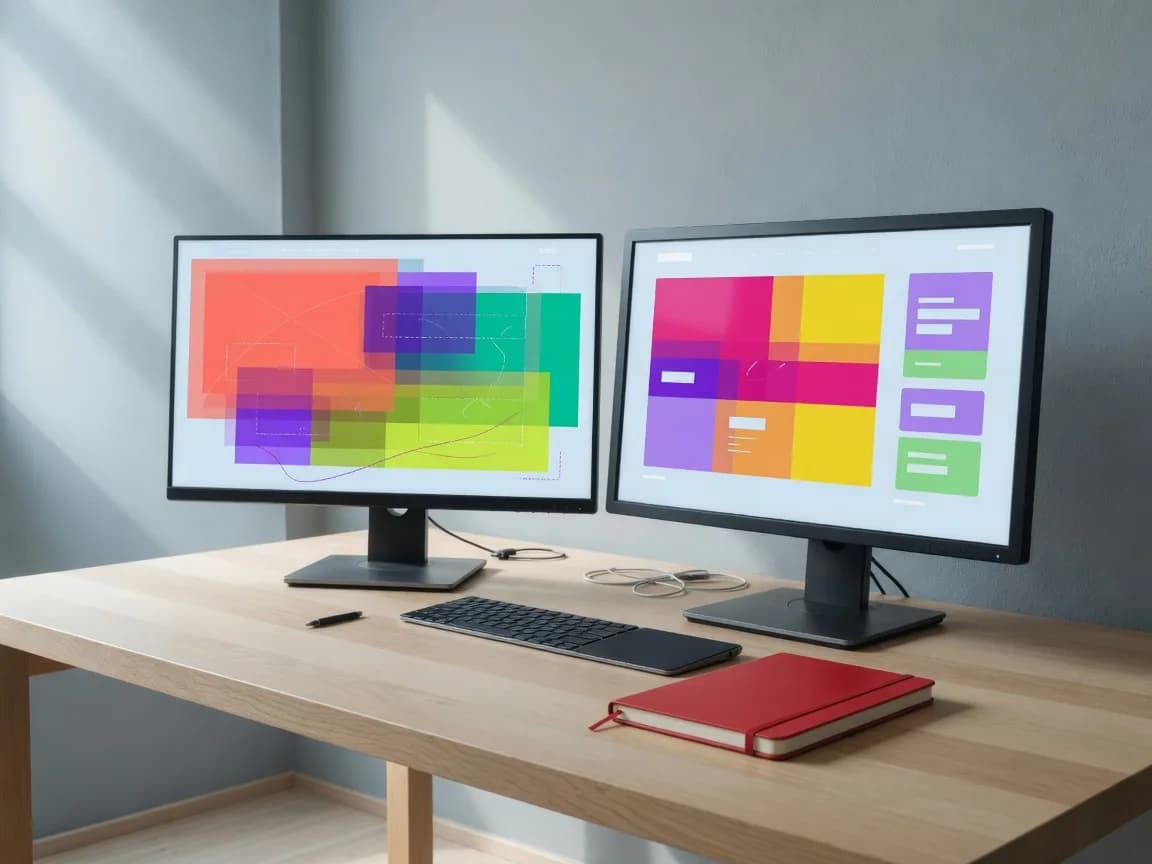
What you get
Mobile-first design approach
Pixel-perfect across devices
Fast load on mobile networks
Better mobile search rankings
What is responsive web design?
Responsive web design means building a website that adjusts perfectly to every screen size, whether a mobile phone, tablet, laptop or desktop. With most internet traffic in India coming through mobile devices, your site needs to look and work well wherever your customers find you.
We deliver lightweight, standards-compliant designs and test them across devices for consistency. You can choose a mobile-specific layout or a single responsive design that fits all screens, and we make responsive layouts the default for every new build.
Why responsive design matters for your business
Google favours mobile-friendly sites in its search results, so a responsive design directly supports your rankings and online presence. A single responsive site also means one domain to manage rather than separate mobile and desktop versions.
Structured, well-presented content lowers bounce rates and keeps visitors engaged. If your existing site was built without a responsive layout, we can convert it so it adapts fully to every device.
- Improved search ranking and stronger online presence
- One domain, no separate mobile and desktop sites
- Lower bounce rates through structured content
Why choose JB Soft System?
For over 25 years we've partnered with 3,300+ businesses across the globe, delivering 4,500+ successful projects. Our work is backed by 261 five-star Google reviews and partnerships with Google, Zoho, AWS and Microsoft 365.
- Experienced in-house design & development team
- Transparent pricing and clear timelines
- SEO-ready, fast and secure builds
- Ongoing support after launch
Frequently Asked Questions
Ready to get started?
Get a free, no-obligation quote from Chennai's trusted web team. We typically reply within a few hours.